Wednesday, 13 November 2013

Monday, 11 November 2013
Planning my Double Page Spread - Draft

To begin with I created a blank adobe photoshop document and presented it in a horizontal fashion so to allow my double page spread to be consturcted. The fist initial stage was to locate the middle of the page, this would help ensure the dimensions for the right and left page were an identical width and height, as it would be unconventional to have one of the pages significantly larger than the previous. I employed the use of the ruler tool and measured the full length of the document, then marked with a line where the centre of the page was. Finally I drew two rectangle shaped boxes on either side so to give two symmetrically sized objects which would represent the two pages of the spread upon its creation.

The secondary step was to insert the main image of interest onto the document, I recovered it from a USB device and dragged it into the photoshop programme. The blue rectangle box which had previously represented the left page of the double page spread was removed and the photograph replaced it in the correct position as to align with the right hand page.

Because I desire the image to be the central attraction and an important focal point for the audience I believed it would be necessity to extend the length of its dimensions so it overlapped with the right hand page - this would emphasise overall its major importance to the viewers of this magazine. To complete this manouver I selected the image and then used the enlargement tool which can be found in the corners of the photograph. I extended it right lengthways and then deleted the black rectangle shape as it was of no further use now that I had established where the text was to be inserted.

To gain an understanding of how the text would appear on the finished product I decided to include the title of the article in an attempt to see how it would be displayed visually to the audience one the product was finally created. Although this isn't the image I wish to incorporate in my final production, i thought it would be good experience to meddle with the colour and positioning of the text now as I will be operating with an identical colour scheme on the main photograph for the finished piece. I manouvered the text at the top of the document and filled it with a deep burgundy red, in correspondance with the shade I am preparing to use in my finished piece.

I filled in the text side of the document with a neutral grey tone as I wanted to view what the spread would look like with an additional colour as a background (disregarding the tones used on the image) After many attempts this was the shade that looked the most acceptable, however it still gives a very childish amateur look to the piece so I'm not sure I want a background colour for the finished product.

Because I was disgusted with how the grey hue appeared on the text side of the spread i removed it and thought it would be better to incorporate white as a primary method before I established whether I wanted a colour background or not. I moved the masthead back into its original central position and inserted a text box tool so i could create some typing to see how the text would be displayed on the page.

A slight adjustment was employed in this stage - the only noticable difference is that I lowered the masthead so it was directly above the text rather than being in the top within the crease line of the magazine alongside the image.

The penultimate stage consisted of me adding a byline to the article, a quote one of the girls mutters in the documentary footage. I included this as an addition to make the double page spread more conventional and professional as t is a common element used by editors within mainstream products. I highlighted it in the same burgundy red as the masthead to provide consistency and so it would be easily identified amongst the greys and black of the image. I positioned it between the photograph and text so it would not be overlooked by the audience reading the document.

The final necessity was to add the channel name and watershed time the documentary would be broadcasted on as this critical piece of information would allow me to achieve the largest potential number of viewers as possible. These vital word were added above the paragraphs for the article, essentially making it one of the primary focal points the reader would notice on first inspection of the spread. I adjusted the byline as I wasn't satisfied with its placement so I moved it slightly lower on the page from its original position.
Thursday, 7 November 2013
Inspiration for my Documentary Poster (Grace Bowman - Thin)
As what was documented in one of my previous blog posts as part of the requirements for my brief I deconstructed several TV programme/documentary posters that advertised the show to the public. The idea of this was to recognise the different elements that are used in these productions (specific text styles, colour scheme etc) to make it a conventional product. I took inspiration from the ones I liked best and I plan to incorporate them into my final finished poster. However I gained a massive insight into my idea through the viewing of a novel I read to draw a personal understanding about the memoir of a young woman who suffered and fully recovered from anorexia nervosa.
The image itself that is displayed on the cover is mysterious yet alluring and it attracts the attention quite dramatically from the audience its targeting (young adults upwards). The photo of the girl excludes her face, I feel this emphasises the seclusion anorexia causes the sufferer to endure as their obsession with food regularly isolates them from reality making them mere fragments of our society. To me it also personifies the disorientation they face when fully under the influence of the condition as it causes so many physical complications like heart flutters and severe migraines, the blurriness henceforth reinforces this significantly. I like the way the woman is posing on the image as it allows the audience to gain a full understanding of her physical deterioration, her bones are clearly visible in her arms and her bodily frame is so petite and fragile it immediately elicits a score of sympathy. This is an element that overall will be the main focus on my poster as I want the photography to provoke an empathetic shocked response from the audience as they can clearly see the malnourishment anorexia has caused to the model.
The layout of the text is fairly consistent with the positioning I would want for my ow poster, I may use this cover as a big influence to construct the position of the text on my final product. The style 'Thin' is written in is a very delicate spiral shape, I feel this relates to the fragility of the body of one plagued with the illness and would be a good concept to include in the text on my poster.
The colour scheme remarkably fits with what I desire as the background is neutral which essentially is what I wish to replicate and most of the writing (neglecting the authors name and reviews) are in a white hue. I would discard the colour element for in my own text and instead convey with the neutral white, grey and black tones. I'm intrigued with the costume design for the model on the cover as a dress is a very simplistic but effective method of attracting the viewers attention to her frame as you could easily mistake her to be a child (yet she is a mature woman) In my photo shoot I intend on dressing my own model in an outfit like a dress as I believe it will illustrate more the fragility of her body now that she has succumbed to anorexia.

Tuesday, 5 November 2013
Inspiration for my documentary poster

Displayed above is the TV constructed poster for the popular American drama show 'The Vampire Diaries' . The main centrefold piece focused upon on this layout is the heavily enlargened face of one of the major characters, Damon, which occupies a large majority of the poster. It can be easily recognised that he is a critical foundation to the programme, hence why the editors have relyed upon him to attract audience attention, they are emphasising his importance to the storyline as he himself is a major element, therefore a hugely major component to the running of the storyline in the show, his appearance will make it easy for regular viewers to identify with whilst also creating a source of interest for new audiences as they may be intrigued to find out more about who this mysterious character is and what relevance he has to the plot. Damon is also an attractive male which would attract the interest of female viewers as they may want to view the show for the 'sex appeal'. This poster minuses any use of a background environment instead incorporating a jet black backdrop instead - this further focuses the attention on Damon as the editors desire all focus to be trained on him so lacking a scene behind him ensures the audience will not be distracted by anything else. I feel this element in particular relates directly to my own poster publication as I am intending on using an enlarged image of one of the anorexic girls of the documentary as the main focus point in gaining the audience's attention, therefore my idea is reinforced significantly by identifying with this specific television advertisement. The title for the programme 'The Vampire Diaries' is included in large font besides Damon to indicate the name of the show but also referencing that the character beside it will be witnessed within the content of the drama itself, reassuring the audience that they will be making an appearance. The font of the text is white illuminating it against the black of the background, this enables it to be extremely noticable to the target audience and not easily overlooked - it is essentially one of the major components their eyeline will be drawn to on first glance of this poster so they will be immeditelly be informed of the name of the programme. This conventional element of this production reinforces the assumption it would be in my own best interests to make my documentary title as visually intriguing and appealing to my target audience as possible - hence I will obtain greater generated interest and the potential rise in viewing numbers. It seems to be a conventional theme of red and white linking all the text together, this literates the message that all the words are related to the same topic conveying coninuity throughout the product giving it a professional edge. Red bloodstains are included under 'The Vampire Diaries' masthead, suggesting there is a condition of horror in this drama and that it is guaranteed to be focused upon the supernatural vampire side of existence. When constructing my own poster for my documentary I feel it is essential I must choose an appropriate colour for the text style, it would be unecessary for the background palette and lettering to clash in colours, so using one as a vantage point (e.g the background in white) to illuminate the title of the show (e.g which is encased in black) would aid me heavily as it is effective in this 'Vampire Diaries' advert. Also included is the name of the television broadcasting network allowing the viewers to be informed of which channel station they must tune into to see the show and the date the premiere episode is about to be screened to alert the audience when it is due to be transmitted therfore the likelhood of them missing out on the episode is slim. Moreover I think it would be beneficial to me to include the distributor of my documentary (The multi award winning BBC station) as this will provide extra information to my viewers about which channel they can engage with the programme on, reducing the chances of them forgetting to view it as they could not remember the network it was on, this significant amount of reinforcement of the BBC logo will prevent this from happening
After deconstructing this particular poster I believe the use of a black backdrop would be most effective in emphasisng the importance of one particular section on the layout - this would be useful to highlight one individual over the rest of the page, moreover I want people to recognise the severities of eating disorders so if i included someone in remission for one against nothing in their immediate surroundings then this will convey the seriousness of the illness more severely to the viewer, that way it cannot be overlooked easily. The red in this piece is excellent in re- affirming the programme is detailing the lives of vampires connotating this message well, therfore the idea of including red in the title on my own poster will help distirbute my idea that anorexia is a life threatening illness that destroys and removes lives - red suggests the danger of the consequences of the illness.
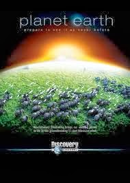
I deconstructed the poster for the most reknowned wild life documentary of this century 'Planet Earth' as it fitted the criteria for my brief - it may not have been of the medical/health genre I am focusing upon yet fitted the style of filming as a 'professional' documentary. The critical aspect that is overall the most noticable foundation is the overwhelming brightness of the sun as it appear in view whilst it is orbiting the earth, the contrast of the illuminous orange and yellow tones works extremely well with the darkness used to represent space - it isntantly draws the eyeline towards the colours as it is virtually unmissible, understandbly it is the first element the audience will be drawn to on intial observation of the product. Through this technique it ensure the secondary convention that will be noticed by the viewer is the title of the documentary itself (i.e Th 'Planet Earth' masthead), the use of bright colours aids in attracting the intentional audience to the more vital components of the poster (such as the title) which will prevent them from being easily overlooked, as essentially these are the elements the creator is desiring their viewers to focus upon the most as a way of remembering the name of the documentary so they are not not miss viewing it.. The creator of the poster has included the broadcasting network (Discovery Channel) pretty much centrefold upon the document, this is essentially a marketing strategy which is used to inform the audience which station the programme can be found within, therefore there is a reduced chance of them missing it if they have been informed as to where to watch it. This critical aspect is vital in brining numbers of viewing audiences up for the profit of the network company and also the distributors of the film themselves. The use of the sun rising over the horizon brings the attention to a number of wildlife that are scattered on the ground of the Earth itself, essentially it is acting as a primary base to draw the audience into more interesting sections of the poster. By noticing the animals (wildebeast and birds) they can assume this documentary will revolve around the nature on Earth (if they had no already deciphered that from the title), however this brings undued emphasis upon the types of organisms that will be focused on within the content. Wildebeast are not an average encountered animal in our every day lives so this gives a preview to the viewers that they will be observing fascinating and interesting creatures they may normally get the opportunity to witness, it emits a nostalgic effect, almost dreamlike, in the sense that yes it is probable that most members of the audience will never have the privledge of seeing these beasts up close in the wild yet it personifies a imaginary world where they can emerse with these creatures as if they were actually there in the wild with them, brining an almost child like fantasy to light. Through the images of the wildlife it can be presumed the target audience will orientate around individuals who are highly interested in nature, possibly children or others who work in this field (for example biologists, ecologists etc). The main background is almost entirely black, with exception of the sun which illuminates the centre image of the Earth to us, not only does this dark shade help highlight the more important features of this poster (the title, animals) but it represents the universe and how Earth is situated in space. In a sense it creates the illusion as if the audience is looking down at the planet from a distance, maybe a satellite or space station and allows them the Earth to appear more glorious and spectacular to what we would normally expect. This illustrates the beauty of our planet and can be used to entice the viewers, the use of these sharp bright colours brings about the concept this programme will be visually appealing to delve into.

I complied with the running theme of deconstructing TV programmes in my final deconstruction which was of an advertisement for 'The Walking Dead'. The most primary noticeable aspect of this production is how simple it has been constructed, there is no major detail displayed with the editor relying solely on using the main character (Rick) to generate the widest amount of audience interest. Noticeably this is due to him being the central character of the show so even if an individual has not viewed the programme personally it is most likely they will be able to connect with this poster as ultimately he is employed as the major source of marketing strategy for the distributors so they may have seen him in various forms of other media. The main dominancy factor in this is of Rick himself who occupies nearly all of the space on the poster, this is to emphasise his importance within the plot and how central he is to the storyline, not only that but he is in direct eye-line with the audience. I feel as if this is a reference to the show as if we were looking at him through the eyes of an enemy (a zombie or another human being) and he is about to end their life as they are seen as a threat. Moreover it could indicate that there will be a new threat in the programme when it returns to television in the fall so its preparing the audience for more action and excitement, which can be generated further by the notion he is holding a gun implying his life may be at risk. The further use of a single character to advertise the show (which can be seen above in my 'Vampire Diaries' deconstruction) greatly convinces me that it would be extremely beneficial to me if I incorporate just one of the anorexic girls into the main image of the poster, this will prevent the audiences attention being diverted to some other aspect of the production but will greatly emphasise the relevance of her to my documentary, signifying a strong link between the girls relevance to the content of the programme itself. The title of the show 'The Walking Dead' is in the largest sizing of font as it is the name and therefore emphasises what is being advertised here, the size imprints on the viewers mind so they will remember it as it is not easily forgotten about or discarded as significantly smaller words might. Noticeably it is encased further in a bold font allowing it to dramatisise its importance on the page so its significance stands out amongst the other wording besides it. I am further convinced by this concept to display the title for my documentary in exceedingly large eye- catching font, this will greatly allow me to capture the immediate interest of my target audience and will reduce the factor of them simply dismissing my product as 'simple' or 'boring'. The date and time of when the programme will be broadcasted is included as a further element to ensure the audience does not miss viewing it and aids in reminding them the specific day to tune in, this is a clever strategy in allowing the maximum number of audience members to view the programme, who will be able to publisize it further by hearsay to other individuals after they have watched it. The use of colour is very specific in this product with the artist relying on dismal dark tones such as black,brown and green to create a sombre yet serious effect in the finished production. This reflects the target audience - it can be clearly identified from the actual image in regards to the weapon the character is holding that this is a show that requires a mature mindset, therefore an adult audience as there will be a possibility of violence and mature themes, which can be identified through the use of the colour scheme. It could also reference to danger as the name of the show suggests 'The Walking Dead' where zombies will be witnessed on many occasions, it contrasts with the brightness on the poster creating a false sense of perception that matters in this show can be addressed and sorted as in reality there is no hope, with the dark colours identifying the death and destruction faced in a apocolyptic world. I get a sense of juxtaposition here with the use of dark and light colours to emphasise the constant struggle of good and evil forces in the plot of the show (the humans and zombies respectively) This colour palette relates well to the mature mindset I am attempting to create in both my documentary poster as I would like the audience to identify through the use of black and white tones that the chosen topic being discussed is one that is not required for the faint hearted and that a serious issue will be dealt with. The use of different font styles is extremely beneficial for this poster in particular, the title of the show 'The Walking Dead'
Wednesday, 30 October 2013
Locations for my Documentary (Home environment)
For the purpose of my documentary it was vital there was a number of 'real life' locations filmed within the content to provide a 'comfort' feeling for my target audience - therefore there would be a greater chance of them identifying with the girls in the filming. The message in my plot would impact harsher and more deeply if they themselves can witness anorexia occurring in familiar environments, emphasising the illness survives in ordinary settings we all encounter in regular life and is not 'worlds away'. Moreover I wanted to gain insight from families involved with the disorder, particularly those who have relations inflicted with an eating disorder as this demonstrates a wider range in the filming style, seperating those girls who are recovering at home from those individuals needing immediate attention in hospital. I managed to gain consent from two families who were interested in participating in the filming of the documentary and was given entry into their homes to document the surroundings as part of my planning stages. The shots presented below are taken from an 18 year old females shared home with her immediate close family.



I took some photographs of the main living room, an ideal setting to conduct interviews in and gain a personal understanding of their every day lives by filming them in regular activities - such as watching TV - to confirm the message to the audience these are normal people no different from them just afflicted with extraordinary circumstances. These sort of rooms are standard in most houses so the viewers should be able to relate to this as a familiar surrounding.

Above is an image of the family kitchen, this is an excellent source to conduct filming in as it will give a personal documentation of meal times with the daughter suffering from anorexia, this is the location she is most likely to be in and where most conflict is to occur if any. I may have to distribute a consent form to the family to sign as tackling private circumstances is a sensitive matter and they may not choose for it to be documented. However if they do it will be an excellent way of displaying how an anorexic prepares her food etc and may shed some typical stereotypical beliefs the audience have about the illness (for example that they don't eat)

The conservatory would be perfect for personal interviews with individual family members as it is a secluded location from the rest of the house therefore the format is less likely to be disturbed. Furthermore the whole layout is relaxing, this aids in making the interviewee more comfortable as causing unecessary stress (because of unfamiliar locations) may cause them to present untruthful answers or demand characteristics (telling the interviewer what they want to hear because they don't feel relaxed enough and not disclosing their true opinions)


I wish to spend more intricate time with the daughter within the confines of her own bedroom, it is a theraputic environment to conduct an interview in as she will be isolated from anyone else who she feels could judge her on her opinions/thoughts, as a bonus it gives her a place to relax as she is comfortable in the surroundings its to commence in. The location broadcasts the notion to my audience that she is still an normal, young adult who enjoys activities, hobbies and interests most other girls her age share, she is more then just an illness which doesn't define her.

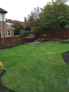
As a final incentive I captured some images of the family back garden to finish my photoshoot. It would have been ideal to do some filming outside however with the bleak, chilly autumn weather I don't consider this an appropriate thought anymore as it may be uncomfortable for people to be in freezing conditions.
Subscribe to:
Posts (Atom)